Your CIMcloud customer site has pre-built navigation menus and links to get your store started but it’s up to you to review and manage these links. To do this you will need to utilize the content workspace in the worker portal. The navigation section of this workspace is where you will manage your menus and links.
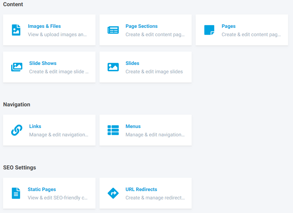
Image 1 – Content Workspace Dashboard Home
The CIMcloud platform comes with two templates, dashboard and retail, to choose from when configuring your customer site(s). The two templates each have their own set of navigation menus. The following series of images show the two templates and the various menus accompanied by the menu’s name. These will be the names you will see when managing your navigation menus in the worker portal.
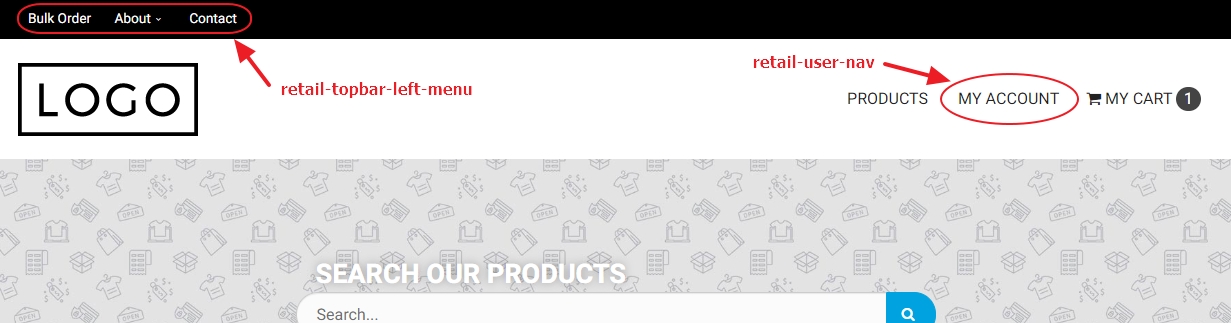
Image 2 – Retail Template Header Menus
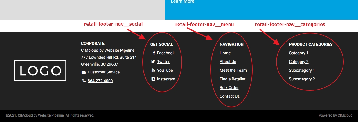
Image 3 – Retail Template Footer Menus
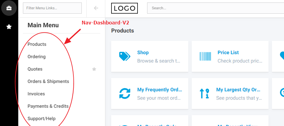
Image 4 – Dashboard Template Main Menu
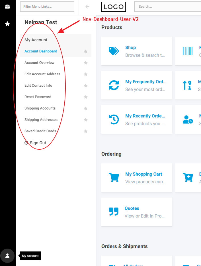
Image 5 – Dashboard Template My Account Menu
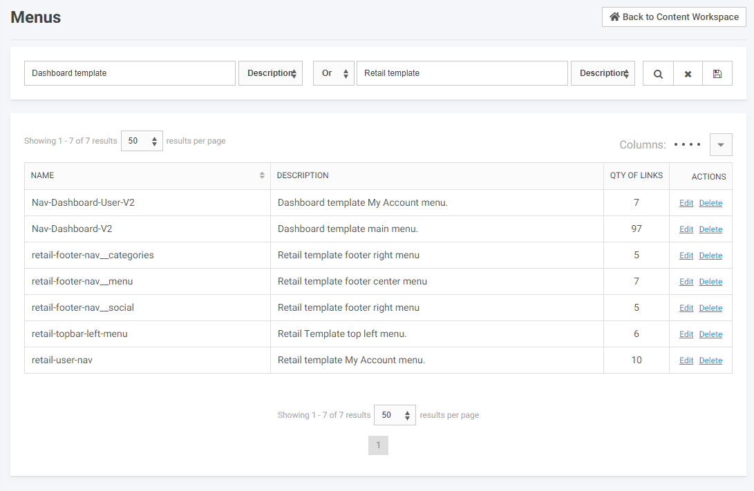
Image 6 – Worker Portal Manage Menus Page
At some point you will most likely want to add or modify these menus and the links within. To do this you will need to determine which menu the link you would like to modify or add belongs. Once you have done that click its edit action link. This will take you to the edit menu page for the selected menu, pictured below.
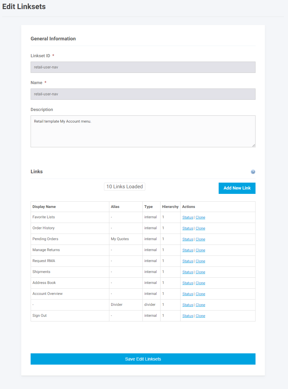
Image 7 – Worker Portal Edit Linksets Page
You will notice in the screenshot above that these links cannot be deleted. This is because these are controlled by the application versioning and deployment system. If you want to make a modification to a menu item you will need to clone it first using the clone action link.
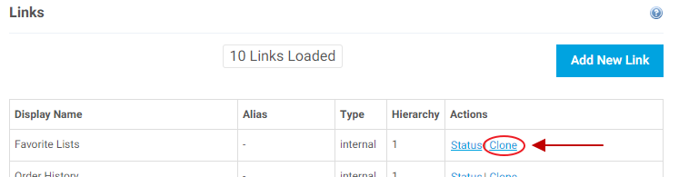
Image 8 – Worker Portal Clone Link
This will add a clone of the selected items just above it in the list. Then all you have to do is change the status of the original link and you are left with your new editable link. This does mean that if the application’s links get changed in a version update your modified links will not be changed/updated.
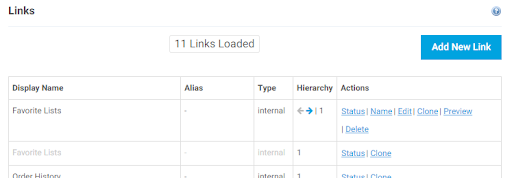
Image 9 – Worker Portal Cloned Favorites Lists Link With Original Link Disabled
If you need to add a link to a menu it can be done with the blue Add New Link button in the top right of the Links section of the Edit Linksets, or Edit Menus, page. This will bring up a popup with the Add New Link page loaded. From here fill out the form adding a display name, type, url, etc. for the new link and click submit at the bottom.
Link Properties
The following is a list of properties you will find on the add link page with their descriptions:
General Information:
- Status
- Allows the link to be enabled or disabled on the site.
- If disabled, the link will not show.
- Allows the link to be enabled or disabled on the site.
- Display Name
- This is the label the customer will see on the site for the Link.
- Alias
- A name to easily search for the Link in the Link Manage page. This is useful for easily searching for a Link that shares a common Display Name with another link, as a way to differentiate the two. Typically The Alias will either be blank or the same as the Display Name setting.
- Short Description
- This setting is used internally when viewing the Link Manage. Like the Alias setting, it is used to easily identify a Link if the Display Name is shared between multiple Links or to easily remember what the Link is for.
Link Settings:
- Link Type
- The different Link types are:
- Menu Header
- Header only, it does not link to a page on the website. Typically used for the top link in a hierarchy and is set up when the website is built.
- Menu Header
- Divider
- Creates a horizontal or vertical divider between links. Commonly used as a way to group common links together. For example, a series of links about customer information (name, address, etc.) may start and end with a divider.
- The different Link types are:
-
- Standard Internal
- Allows you to enter the url for a page on the website to which the link goes. Typically used for static pages where you would enter a url with the format foldername/pagename.asp or if linking to a page in the website that is not in the webpage catalog, i.e. my_account.asp
- Standard External
- Allows you to enter the url for a page that is external to the website. You enter the complete url in the box. For example, http://www.google.com
- Web Page
- Allows you to select a page that is already set up in the web page catalog. For static pages you create you will need to use a Standard Internal link.
- Email
- Creates a link that pops open an email and populates it with the To email address and Email Subject that you enter.
- Standard Internal
Depending on the Link Type setting selected, a secondary set of settings will be displayed. These settings are:
- URL
- The value of the URL setting will vary depending on the selection of the Link Type:
- Menu Header
- Enter url if header is a link.
- Menu Header
- The value of the URL setting will vary depending on the selection of the Link Type:
-
- Divider
- Contains the HTML code to generate the divider. No need to change it.
- Divider
-
- Standard Internal
- Enter the internal URL. The format is: foldername/pagename.asp for static pages or pagename.asp for internal pages other than static pages (i.e. my_account.asp).
- Standard Internal
-
- Standard External
- Enter complete url, for example http://www.google.com.
- Standard External
-
- Web Page
- When you select the page from the pop up box, the Content Page will appear in the URL box.
- Web Page
-
- Link Icon
- CIMCloud uses Font Awesome to display icons in the Navigation Links. Icons can be added as needed using the codes found at Font Awesome. Example: icon-user (Font Awesome: https://fontawesome.com/v3.2.1/icons)
- Link Icon
-
- Divider Orientation
- Used to set the divider horizontally or vertically.
- Divider Orientation
-
- Web Page
- Click the magnifying glass and select a page from the box that pops up. The box lists all the pages in the webpage catalog.
- Web Page
-
- Email Address
- Enter the email address to which the email should be sent. Enter multiple email addresses by separating them with a semicolon (‘;’).
- Email Address
-
- Email Subject
- Enter the words you want to appear in the email subject field. For example: Newsletter Signup
- Email Subject
Linkset Info:
- Linkset
- The Linkset selection allows you to choose a Menu to place the Link under. (Note: The terms “Linkset” and “Menu” are used interchangeably.)
- Sort Order
- The Sort Order setting allows you to set the placement of the Link relative to other Links in the Menu they belong to. 0 is the first position and it is sorted in an ascending fashion (i.e. 1, 2, 3, 4).
- Level
- The Level setting corresponds to the nesting of the Link in the Menu . If a Link is desired to be nested under another Link in the same Menu the parent Link will have a lower numbered level than the child Link to be nested below it.
Link Settings – UL Tag Properties (Only for Parent Links):
- Class Name(s) (Optional)
- The Class Name(s) setting refers to the HTML class attribute for the ul element. This is used for custom styling and is optional.
- Inline Style(s) (Optional)
- The Inline Style(s) setting refers to the inline CSS style attribute for the ul element. This is used for custom styling, CSS knowledge is required, and is optional.
Link Settings – LI Tag Properties:
- Class Name(s) (Optional)
- The Class Name(s) setting refers to the HTML class attribute for the li element. This is used for custom styling and is optional.
- Inline Style(s) (Optional)
- The Inline Style(s) setting refers to the inline CSS style attribute for the li element. This is used for custom styling, CSS knowledge is required, and is optional.
Link Settings – A Tag Properties:
- Class Name(s) (Optional)
- The Class Name(s) setting refers to the HTML class attribute for the a element. This is used for custom styling and is optional.
- Inline Style(s) (Optional)
- The Inline Style(s) setting refers to the inline CSS style attribute for the a element. This is used for custom styling, CSS knowledge is required, and is optional.
- Extra <A> Tag Properties (ie Target=”Blank”)
- This setting is used to add other attribute / value pairs to the a tag. HTML knowledge is required.
Link Settings – Login Display Settings:
- Display Link When User Is
- This setting is used to show the link when a user is logged in, logged out, or set to always show.
- Add Autopage to Link
- This setting allows for users to be redirected to the page they were directed to when clicking the Link, but required to sign in first before viewing the page. If ‘Yes’ is selected and the user is required to login to view the page the Link directs to, if they are not already logged in, they will be directed to the page the Link directs to after logging in. If ‘No’ is selected, they will be directed to the default page of the site instead, after logging in.