Overview:
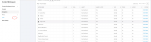
Navigation Links are a way for a Worker to configure hyperlinks on the website. Use the Links menu link under the Navigation menu in the Content Workspace to create additional Navigation Links. Navigation Links are then added to using the Menus link to create organized lists of hyperlinks that allow customers to navigate the site.
Step-by-Step Process:
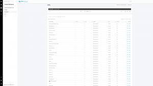
1. Sign in as a Worker and navigate to the Links task on the Navigation menu in the Content Workspace to display the Manage Links page:
Navigation Links can be found by navigating to Content Workspace → Content → Navigation → Links, when logged in as a Worker.
This will bring you to the Manage Links page.
2. To edit an existing Link, click ‘Edit’ under the Actions column.
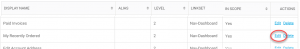
3. To create a new Link, click the ‘+’ icon next to ‘Links’ in the menu or the + Add Link icon at top of the page.
4. When you click the ‘+‘ icon or Edit link you will be directed to access the Navigation Link Add/Edit page. Here there are Several categories that allow for setting different configurations for configuring the link.
General Information:
- Status
- Allows the link to be enabled or disabled on the site.
- If disabled, the link will not show.
- Allows the link to be enabled or disabled on the site.
- Display Name
- This is the label the customer will see on the site for the Link.
- Alias
- A name to easily search for the Link in the Link Manage page. This is useful for easily searching for a Link that shares a common Display Name with another link, as a way to differentiate the two. Typically The Alias will either be blank or the same as the Display Name setting.
- Short Description
- This setting is used internally when viewing the Link Manage. Like the Alias setting, it is used to easily identify a Link if the Display Name is shared between multiple Links or to easily remember what the Link is for.
Link Settings:
- Link Type
-
- The different Link types are:
- Menu Header
- The different Link types are:
-
-
-
- Header only, it does not link to a page on the website. Typically used for the top link in a hierarchy and is set up when the website is built.
-
-
-
- Divider
- Creates a horizontal or vertical divider between links. Commonly used as a way to group common links together. For example, a series of links about customer information (name, address, etc.) may start and end with a divider.
- Standard Internal
- Allows you to enter the url for a page on the website to which the link goes. Typically used for static pages where you would enter a url with the format foldername/pagename.asp or if linking to a page in the website that is not in the webpage catalog, i.e. my_account.asp
- Standard External
- Allows you to enter the url for a page that is external to the website. You enter the complete url in the box. For example, http://www.google.com
- Web Page
- Allows you to select a page that is already set up in the web page catalog. For static pages you create you will need to use a Standard Internal link.
- Email
- Creates a link that pops open an email and populates it with the To email address and Email Subject that you enter.
- Divider
Depending on the Link Type setting selected, a secondary set of settings will be displayed. These settings are:
- URL
-
- The value of the URL setting will vary depending on the selection of the Link Type:
- Menu Header
- The value of the URL setting will vary depending on the selection of the Link Type:
-
-
-
- Enter url if header is a link.
-
-
-
-
- Divider
-
-
-
-
- Contains the HTML code to generate the divider. No need to change it.
-
-
-
-
- Standard Internal
-
-
-
-
- Enter the internal URL. The format is: foldername/pagename.asp for static pages or pagename.asp for internal pages other than static pages (i.e. my_account.asp).
-
-
-
-
- Standard External
-
-
-
-
- Enter complete url, for example http://www.google.com.
-
-
-
-
- Web Page
-
-
-
-
- When you select the page from the pop up box, the Content Page will appear in the URL box.
-
-
-
-
- Link Icon
-
-
-
-
- CIMCloud uses Font Awesome to display icons in the Navigation Links. Icons can be added as needed using the codes found at Font Awesome. Example: icon-user (Font Awesome: https://fontawesome.com/v3.2.1/icons)
-
-
-
-
- Divider Orientation
-
-
-
-
- Used to set the divider horizontally or vertically.
-
-
-
-
- Web Page
-
-
-
-
- Click the magnifying glass and select a page from the box that pops up. The box lists all the pages in the webpage catalog.
-
-
-
-
- Email Address
-
-
-
-
- Enter the email address to which the email should be sent. Enter multiple email addresses by separating them with a semicolon (‘;’).
-
-
-
-
- Email Subject
-
-
-
-
- Enter the words you want to appear in the email subject field. For example: Newsletter Signup
-
-
Linkset Info:
- Linkset
-
- The Linkset selection allows you to choose a Menu to place the Link under. (Note: The terms “Linkset” and “Menu” are used interchangeably.)
- Sort Order
-
- The Sort Order setting allows you to set the placement of the Link relative to other Links in the Menu they belong to. 0 is the first position and it is sorted in an ascending fashion (i.e. 1, 2, 3, 4).
- Level
-
- The Level setting corresponds to the nesting of the Link in the Menu . If a Link is desired to be nested under another Link in the same Menu the parent Link will have a lower numbered level than the child Link to be nested below it.
Link Settings – UL Tag Properties (Only for Parent Links):
- Class Name(s) (Optional)
-
- The Class Name(s) setting refers to the HTML class attribute for the ul element. This is used for custom styling and is optional.
- Inline Style(s) (Optional)
-
- The Inline Style(s) setting refers to the inline CSS style attribute for the ul element. This is used for custom styling, CSS knowledge is required, and is optional.
Link Settings – LI Tag Properties:
- Class Name(s) (Optional)
-
- The Class Name(s) setting refers to the HTML class attribute for the li element. This is used for custom styling and is optional.
- Inline Style(s) (Optional)
-
- The Inline Style(s) setting refers to the inline CSS style attribute for the li element. This is used for custom styling, CSS knowledge is required, and is optional.
Link Settings – A Tag Properties:
- Class Name(s) (Optional)
-
- The Class Name(s) setting refers to the HTML class attribute for the a element. This is used for custom styling and is optional.
- Inline Style(s) (Optional)
-
- The Inline Style(s) setting refers to the inline CSS style attribute for the a element. This is used for custom styling, CSS knowledge is required, and is optional.
- Extra <A> Tag Properties (ie Target=”Blank”)
-
- This setting is used to add other attribute / value pairs to the a tag. HTML knowledge is required.
Link Settings – Login Display Settings:
- Display Link When User Is
-
- This setting is used to show the link when a user is logged in, logged out, or set to always show.
- Add Autopage to Link
-
- This setting allows for users to be redirected to the page they were directed to when clicking the Link, but required to sign in first before viewing the page. If ‘Yes’ is selected and the user is required to login to view the page the Link directs to, if they are not already logged in, they will be directed to the page the Link directs to after logging in. If ‘No’ is selected, they will be directed to the default page of the site instead, after logging in.
Data Sets:
Data Sets allow links to be restricted to specified customers.
Results:
New navigation links are created, configured, and added to a menu on the platform.